debbie millman

Tuesday, April 29, 2008

Memory and Art: The Human Camera


Stephen Wiltshire from London is a star among savants. Stephen is autistic. He did not speak his first words "pencil" and "paper" until he was 5. Yet, when he was 11 he drew a perfect aerial view of London after only one helicopter ride. In this film, Stephen draws an aerial view of Rome after one viewing. It takes him three days to draw what he saw for 45 minutes.

Monday, April 28, 2008

Standard Operating Procedure?


In the course of gathering material for his upcoming documentary on Abu Ghraib, Academy Award-winning director Errol Morris conducted over 200 hours of interviews with key figures. Col. Janis Karpinski, at the time of Abu Ghraib a Brigadeier General, was the commander of the prison and later in charge of Saddam Hussein once he was captured. After the Abu Ghraib photographs were made public, Karpinski was demoted. I saw the film yesterday and it was disturbing and tragic. Kyle Cooper's lush titles and graphics were out of place, as was Danny Elfman's score, but it is a movie that should be seen.

Interesting juxtaposition when considering Susan Sontag's On Photography, and a good, really well written review of the film from Teddy Blanks on Design Observer here.

A full-length interview with Errol Morris and Philip Gourevitch, which this clip is excerpted from can be found here.

And, finally, the official trailer for the film:

Friday, April 25, 2008

Design Matters Today with Designer and DJ Michael Hodgson

Mick's playlist!

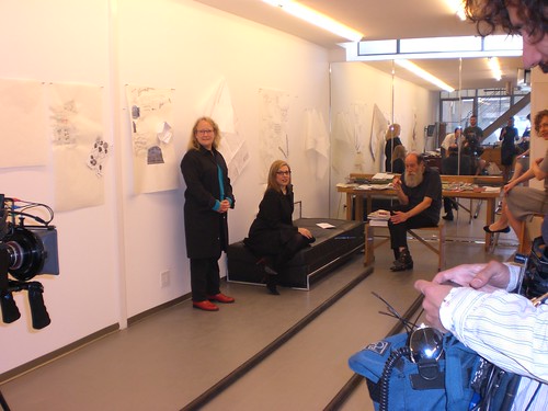
It is Friday again! That means that Design Matters is live at 3 PM ET. My guest today is Designer and DJ Mick Hodgson of PhD. We will be broadcasting the annual Design Matters mostly music show, and Mick will be spinning a wide variety of excellent tunes.

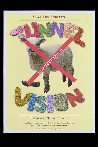
Ph.D is a Santa Monica based graphic design office established in 1988 by designers Clive Piercy and Michael Hodgson. Over the years, it's client roster has included a diverse mix of Fortune 500 and innovative companies such as 20th Century Fox, Border Grill, Chronicle Books, Frederick Fisher & Partners, The Getty Foundation, Herman Miller, liveBooks, Nike, Nordstrom and The Rand Corporation. Noted for its crisp thinking, wit, clear expression and meticulous craft, Ph.D has garnered many awards nationally and internationally for the full range of graphic design work including brand identity systems, print advertising, exhibit design and web design, excelling in both consumer and business to business communication.

Today, Ph.D is led by principal Michael Hodgson, an advocate for sustainable design and a leader in the local and national design community. Michael studied at St. Martin's School of Art in London and graduated from Brighton College of Art in East Sussex, England in 1974. He was art director of Harpers & Queen magazine working with the legendary Willie Landels until 1979. Michael is President Emeritus of AIGA Los Angeles and now serves on the advisory boards of both the AIGA Los Angeles chapter and the AIGA Center For Sustainable Design. He has juried many national design and student scholarship competitions. Michael is married with three beautiful daughters, Lily, Maudie Rae and Lucie. When he is not working, he can often be found riding the roads and trails of his beloved Santa Monica Mountains.

Design Matters is from 3-4PM EST and you can view the VoiceAmerica Business site and listen to the show from a myriad of locations:

You can go here, through the Sterling link: http://www.sterlingbrands.com/ListenLive.html
Or you can go here, through the Voice America link: http://www.modavox.com/VoiceAmericaBusiness/
Or you can go here, through the Designers Who Blog link: http://www.designers-who-blog.com

MANY THANKS TO ADOBE FOR THEIR SUPPORT OF DESIGN MATTERS and to all of our wonderful listeners.

PLEASE NOTE: This will be our last live show until September when we will be back on the air for Season Five, Part II with guests Narciso Rodriguez, Steve Heller & Lita Talerico, Jeff Scher, Paul Sahre, Gary Panter & Helene Silverman, John Gall, Allan Chochinov, Dr. Jill Bolte Taylor, Natalia Ilyin, Chris Dixon and others.

As always, thank you for listening!

Thursday, April 24, 2008

Inspiring Information Graphics

Even Edward Tufte would approve of these:

Useful Graphics for your Presentation

Useful Graphics for your Presentation

Useful Graphics for your Presentation

Useful Graphics for your Presentation

Via The Media Dude

A Magical Day with Lawrence Weiner

A Magical Day with Lawrence Weiner

A Magical Day with Lawrence Weiner

A Magical Day with Lawrence Weiner

These photographs are from a collection of stills from a forthcoming episode of Design Matters Live with the brilliant artist Lawrence Weiner, directed by the extraordinary Hillman Curtis.

Photos copyright Lisa Grant and may not be used without the express, written permission by the photographer and director.

Tuesday, April 22, 2008

Astronomy Picture of the Day

Spiral Galaxies in Collison

From my new favorite website: Astronomy Picture of the Day.

This picture is from a few days ago and is titled Spiral Galaxies in Collision.

The explanation (from the site) is as follows:
Billions of years from now, only one of these two galaxies will remain. Until then, spiral galaxies NGC 2207 and IC 2163 will slowly pull each other apart, creating tides of matter, sheets of shocked gas, lanes of dark dust, bursts of star formation, and streams of cast-away stars. Astronomers predict that NGC 2207, the larger galaxy on the left, will eventually incorporate IC 2163, the smaller galaxy on the right. In the most recent encounter that peaked 40 million years ago, the smaller galaxy is swinging around counter-clockwise, and is now slightly behind the larger galaxy. The space between stars is so vast that when galaxies collide, the stars in them usually do not collide.

As you can well imagine, they feature lucious new photographs everyday.

Credit: Debra Meloy Elmegreen (Vassar College) et al., & the Hubble Heritage Team (AURA/STScI/NASA)

Via Kottke.

Recent Press

From the New York Times

Eric Karjaluoto of Ideas on Ideas

I feel so incredibly lucky to share some recent press: My guardian angel, Steve Heller, included me in a fun article about McCain's use of typography in the New York Times and my friend Eric Karjaluoto from interviewed me on his wonderful site Ideas on Ideas. I think my favorite thing about the interview is the little crocodile graphic Eric created for the piece.

Saturday, April 19, 2008

The Droste Effect

The Droste Effect

As I have revealed on this website before, my favorite cookie of all time was a brand made by Keebler named Fudgetown. In addition to the mystical taste these cookies provided, I also fell under the spell of the package containing these blissful morsels. Of course it featured the Keebler Elves, but in as much as I found these brand icons amusing and entertaining, it was not the Elves that captured my interest. What had me utterly mesmerized was what the Elves were doing. What had me positively transfixed was the illustration on the front face panel of the cookie package that featured the Keebler Elves holding a package of Fudgetown cookies. Which meant that the Keebler Elves holding a package of Fudgetown cookies were holding a package featuring the Keebler Elves holding a package of Fudgetown cookies. And so on and so on and so on. The Keebler Elves holding the package of Keebler Elves holding the package was infinite! This killed me! I would stare at the package for hours on end, trying to pinpoint the moment I could see the singularity: where the Keebler Elf and the cookie package both originated. It all ended up in a single point that was indiscernible and I was both entranced and perplexed as to the notion of this infinite lineage. This became my entrée to the concept of infinity, and I found the philosophic conundrum it represented and the unresolved mystery both wondrous and stupefying.

So it was with utter delight that I discovered that the act of a pack featured on a pack has an ACTUAL NAME: The Droste Effect. THIS THRILLS ME. I discovered the term while stumbling upon my new favorite website: Randy Ludacer's Box Vox. From the site:

At my grocery store I could only find three examples: Land O’Lakes Butter, Morton Salt and Cracker Jacks. These packages each include a picture of the package itself and are often cited by writers discussing such pop-math-arcana as recursion, strange loops, self-similarity, and fractals.

This particular phenomenon, known as the “Droste effect,” is named after a 1904 package of Droste brand cocoa. The mathematical interest in these packaging illustrations is their implied infinity. If the resolution of the printing process—(and the determination and eyesight of the illustrator)—were not limiting factors, it would go on forever. A package within a package within a package... Like Russian dolls.

Since so many products are nearly indistinguishable from their packaging—(a tube of ChapStick, a can of Coke)—I figured that there would be lots of examples. My brief supermarket survey showed me otherwise. It’s quite rare. You can easily find packaging that includes packaging pictures, but it’s almost always a picture of the inner packaging—(the outside of the box shows the packets contained within)—or else it’s a cross-marketing campaign where pictures of other packages in the product line are shown—usually on the back.

The Droste effect seems to be most applicable to packaging with illustrations. For those products that include an illustrated mascot, it would seem a natural thing to have the mascot holding the product package. Tony-the-Tiger holding up a box of Frosted Flakes. The Planter Peanut fellow offering us peanuts from a jar or a can. What aren’t the mascots doing this? The reasons are perhaps understandable. Better to emphasize the consumer’s end use of the product or to convey the purity of the ingredients. (Rather than to make their packaging into recursive ads-within-ads.) Hence: a bowl of frosted cornflakes ready to eat; mixed nuts offered to guests, not from the can, but from an elegant serving dish.


The writer and readers then go on to list other packages featuring The Droste effect.

Today is a happy day.

Thursday, April 17, 2008

April is the Coolest Month

An update for Design Matters fans! The last two shows of Part One of Season Five will be tomorrow and next Friday, April 25th. In honor of National Poetry Month, tomorrow's show will be an all spoken word show: poetry, short stories, essays and prose. It should be wonderful.

Next Friday will feature the fabulous Mick Hodgson of PhD spinning an all music show.

Friday, April 11, 2008

Liz

The office is fifty-three narrow steps up on the second floor of a dilapidated warehouse on Mott Street, one block north of Chinatown. The walls are a cool parchment grey, the ceilings smoky and cracked. There is a faint odor of fried pork, likely emanating from Excellent Dumpling, which is around the corner on Lafayette Street. The woman at the desk has soft, dreamy features: big lips, moon-like eyes. Her fishnet stockings camouflage six mosquito bites on her legs, and her uncomfortable black sling backs add three inches to her petite frame, though she still appears slight. She is smoking a cigarette with soft sucking, somewhat exaggerated, rhythmic exhalations. She is designing a poster for a peace rally. She is fumbling with the type and can’t get it right. Should it be bolder? Should it be italic? Should it be red? She gives up and pushes her mouse away. She thinks posters are the cruelest thing to design—there’s no place to hide if she has nothing interesting to say.

All she really wants to do is tell the man at the desk next to her how she feels about his shimmering pale skin, that she is afraid if she reaches out and touches him that her hand will pass right through him. She wants to tell him that the lazy green grey color of his eyes makes her heart ache. She wants to tell him that this makes her happy and everything she sees is sharp and clear and she smells every smell as the air hits her and all this makes her feel as if she could make the impossible possible. She wants to tell him this, but she doesn’t. She looks down, she pushes her black, messy, curly hair away from her round face and she checks her email. Then she looks at him again as she exhales from her cigarette.

The man has black gold hair down to his shoulders; he hasn’t shaved in several days, his Liz Phair cotton tee shirt is un-tucked and the singer’s pouty mouth is yawning. His khaki’s are starched, the pleats profoundly apparent, his sneakers are as white as his skin. He is confident and beautiful and bored. He too is struggling with the poster. He glances at what is on the computer in front of the woman next to him and believes that his work is less terrible than hers and he chuckles to himself. He thinks about the night before and wishes he was back in the dirty bar with the bad martinis or better yet, that he was back in bed with the dirty girl from the bar. He could still smell her sweat on his fingers and he licks them. They are salty and musky and slightly bitter. He likes this and he remembers that this is the way she tasted and he runs his tongue back and forth across the inside of his teeth. He takes a sip of the cold, murky coffee that has been sitting in the white Styrofoam cup for the past two hours. What was her name again? He can’t remember. He grimaces and plays with the type on his screen.

The woman next to him sighs in frustration. She slides away from her desk with an exaggerated motion and examines a mosquito bite. She looks up at the man and frowns as she takes in Liz Phair, the white sneakers, the black hair. She tells him she feels like going downstairs for a Starbucks, and as she stuffs a twenty into her jacket pocket, she asks the man if he wants one. He looks up, glances around the dingy room, squints at the curly-headed girl and says, thanks, but no thanks, he’s good.

Design Matters Today with Modern Dog

Poster by Modern Dog

Poster by Modern Dog

It is Friday again! That means that Design Matters is live at 3 PM ET. My guests today are Robynne Raye and Michael Strassburger of Modern Dog.

Since cofounding the design studio Modern Dog Design Co. in 1987, Robynne Raye has continued to do work for retail and entertainment companies—both local and national—and counts posters, packaging, and identity design as some of her favorite work. Her work has been exhibited internationally and her posters are in the permanent collections of museums around the world, including the Louvre (Rohan Marsan wing), the Library of Congress, Bibliotheque Nationale de France, Hong Kong Heritage Museum, Denver Art Museum and the Warsaw National Museum. Robynne is an adjunct instructor at Cornish College of the Arts in Seattle where she has been teaching upper lever design courses for 8 years.

Michael Strassburger has more than 20 years of professional experience in graphic and interactive design as one of the cofounders of Modern Dog Design Co. His work ranges from brand identity to package design to motion graphics to music composition. His work has been exhibited internationally and his posters are in the permanent collections of museums around the world, including the Louvre (Rohan Marsan wing), the Library of Congress, Experience Music Project, Hong Kong Heritage Museum and the Warsaw National Museum. He currently teaches interactive design at Cornish College of the Arts in Seattle.

A partial list of Modern Dog's clients include: Adobe Systems Inc, Olive Green Dog Products, Nordstrom, Seattle Aquarium, Live Nation, HarperCollins, Shout! Factory, and Blue Q. a 20 year retrospective was published by Chronicle Books documenting Modern Dog's poster work

Design Matters airs live weekly on the Voice America Business Network, now the industry leader in Internet talk radio. The show was voted a "favorite podcast" on PSFK's Marketing Podcast survey and was recently voted 9th out of over 300 entries for the Cooper Hewitt National Design Museum’s People’s Choice Award. The show is also available as Podcasts on iTunes, where over 100,000 people now download the show every month.

Design Matters is from 3-4PM EST and you can view the VoiceAmerica Business site and listen to the show from a myriad of locations:

You can go here, through the Sterling link: http://www.sterlingbrands.com/ListenLive.html

Or you can go here, through the Voice America link: http://www.modavox.com/VoiceAmericaBusiness/

Or you can go here, through the Designers Who Blog link: http://www.designers-who-blog.com

Lots of choices.

Everyone is welcome to call in live and toll free--the number is 1.866.472.5790.

Thursday, April 10, 2008

Astral Sandbox of 1970s Homage

Amazingness

More Amazingness

These are vinyl record sleeves with 2-sided insert featuring faux-academic material on pop music and the state of the record industry, seeded with promotional material for indie radio stations created by Nikolay Saveliev. 140 copies were snuck onto used & new record store shelves.

From an interview on Future Shipwreck:

I like the idea of a consolidated aesthetic totality; what you make looks like what you listen to, sounds like what you wear, and speaks like what you believe in. In simpler terms, my girlfriend might look like she's in a band I'd listen to, my haircut looks like it belongs in the chair I'm sitting in, and the work I'm designing might be written about in a book that I would read. Even my cat has to figure in there somehow. It's a meticulous thing to maintain, but probably comes from the fact that I've discovered mostly everything through music, whether it's ideologies, writers, artists, designers, cultures, subcultures, or other music. So it's easy to tie things back into your work, as long as you keep your eyes and ears open, and maintain a healthy dose of critical thought.

This shop dropping initiative was sponsored by Brown Student Radio. Man, would I kill to get my hands on one.

Via the resplendent Kottke, of course.

Monday, April 07, 2008

Now that's more like it: Janet & Madonna, Frickie Frickie


And! You can download the mp3:
http://download.yousendit.com/18DE777

Saturday, April 05, 2008

How Could She?


She's written the greatest song since Music's Don't Tell Me and now she goes and does this?

*sigh*

Friday, April 04, 2008

AIGA Jacksonville re:CHARGE Conference April 3-5

AIGA Jacksonville reCharge Conference

Designers and other professional creatives in the fields of advertising and communications often get lost in the daily grind. The result — Creative Monsters that become cranky, restless and bored.

Presented by the Jacksonville Chapter of the AIGA, and sponsored by Font Bureau, re:CHARGE is a 2.5-day conference designed to re-energize and inspire the Creative Monster in each of us. The 2008 conference will be held April 3-5 in Downtown Jacksonville, Florida.

Professional designers and leaders in communication design will conduct exciting workshops. Workshops that will give you the opportunity to feed your Creative Monster, socialize with other designers, understand new concepts and methods in design, and participate in hands-on activities to reinvigorate their creativity. There’s also a day set aside for sightseeing and socializing, something every Creative Monster needs.

re:CHARGE is the only conference dedicated to rehabilitating Creative Monsters and educating owners on their care and feeding. After attending re:CHARGE, most designers find they have a greatly increased chance of living a creative, productive life with their monsters.

I will be speaking on Friday and moderating a panel discussion on Saturday. Hope to see you there!

Thursday, April 03, 2008

Worrying Solves Nothing

Stefan's Film Title

Glimpse of Stefan's exhibit

A luminous film about Stefan Sagmeister's exhibit at Deitch Projects shot by the always incredible Hillman Curtis.
Click here to see the film.

Wednesday, April 02, 2008

Skin Origami

From Best of The Daily Siege, by Clayton James Cubitt Thoughts On Neogender, originally on Nerve:

“Male to female transsexual. This is a manufactured vagina. A Neovagina.

This is genital origami, the cock cut open, carved and folded, crafted by techniques with names like Penile Inversion, the Suporn Technique, and the Wilson Method. The head of the cock morphs into the neoclit. In some methods the scrotal skin becomes the neovaginal canal.

I don’t know which methods were used in the creation of this particular neovagina, but surely this is art of the highest caliber. Sculpture in flesh tissue and nerve bundles.

Is it subtractive sculpture, like Michelangelo’s Pieta, or David? Is the surgeon removing and reshaping a raw outer form crudely delivered by nature, slowly, painfully revealing the inner form of his patient’s mind’s eye? No, both inner and outer forms were delivered by nature, nested possibilities contradicting each other. Which should be considered natural? As in fetal development, male nested inside of female, female morphing into male. We all start out the same.

Perhaps this is a third sex. The concept of a third sex is one that’s been around for centuries in Indian and Thai cultures, and has come in and out of popularity in the Western world in modern times. Do we need to have a binary view of gender? Is it either/or?

She’s had her Adam’s Apple shaved off through an incision in her throat. She’s had breasts created. She floods her body with hormones. After her vaginoplasty she ruptured and almost bled to death.

She almost died to become who she was meant to be. This is being born again as no Christian could ever conceive of. When asked what the most important possession in the world was to her, she simply presented a small white plastic object, two by three inches.

Her health insurance card.”

Via Kottke.

Tuesday, April 01, 2008

Before and After

Before and After

This sombre portrait is from a series of people photographed before and after they died. It is a challenging and poignant study by German photographer Walter Schels and his partner Beate Lakotta, who recorded interviews with the subjects in their final days. The series reveals much about dying - and living. Life Before Death is at the Wellcome Collection in the UK from April 9-May 18.

This portrait is of Klara Behrens. She was 83 years old.

The photo on the left was taken on February 6, 2004.

From the Guardian website: She knows she hasn’t got much longer to live. “Sometimes, I do still hope that I’ll get better,” she says. “But then when I’m feeling really nauseous, I don’t want to carry on living. And I’d only just bought myself a new fridge-freezer! If I’d only known!”

The photo on the right was taken on March 3 2004.

Before she died she stated, "I wonder if it’s possible to have a second chance at life? I don’t think so. I’m not afraid of death — I’ll just be one of the million, billion grains of sand in the desert…”
things i paint
things i photograph
design matters design matters poster designed by Firebelly
about me things i do those i thank things i like current playlist